“L’Elefante” (The Elephant) by Topipittori
On Thursday, October 6th, at 18.30, presentation of a new book illustrated by Riccardo Guasco and published by Topittori: “L’Elefante”.
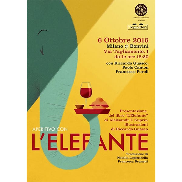
On Thursday, October 6th, at 18.30, presentation of a new book illustrated by Riccardo Guasco and published by Topittori: “L’Elefante”.
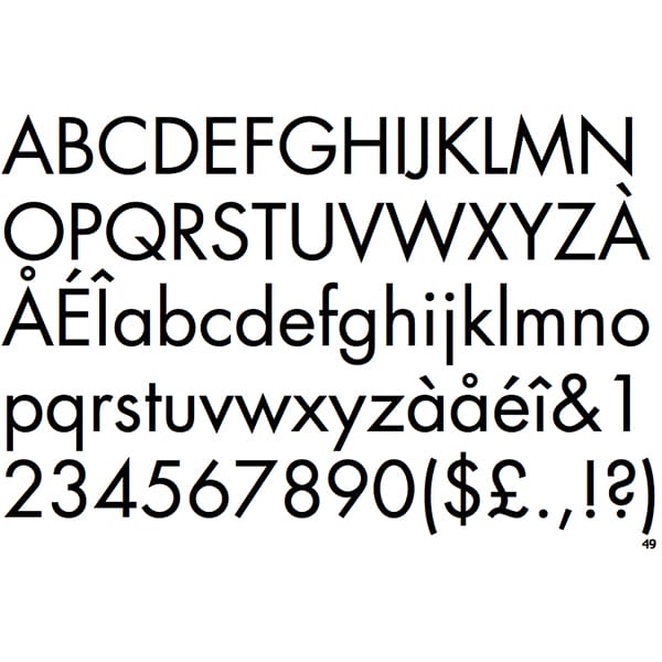
Ultima news di agosto: la dedichiamo al grande Paul Renner, (Wernigerode, 9 agosto 1878 – Hödingen, 25 aprile 1956), tipografo e designer conosciuto soprattutto per aver progettato un carattere tipografico di grande successo, diventato un capolavoro senza tempo, il Futura.
Renner è stato un graphic e type designer di straordinaria importanza per grafici e tipografi del XX secolo: il suo Futura, che dopo travagliate elaborazioni vide la luce nel 1927, è diventato il carattere che ha interpretato il cambiamento culturale ed estetico del Novecento, influenzando in maniera radicale la disciplina del disegno dei caratteri e penetrando successivamente nelle officine tipografiche di tutto il mondo.
Il Futura rappresentò da un lato la soluzione tecnica e formale di quell’ansia di modernizzazione che fin dal Bauhaus animava la cultura tipografica europea, dall’altro la perfetta risposta alle nuove necessità espressive della stampa e della comunicazione.
Ancora oggi il Futura è uno di quei caratteri con cui “non si sbaglia mai”: a quasi novant’anni dalla sua apparizione è il “san serif” ( font senza grazie) che suggerisce – con le sue articolate e diverse “forze” tipografiche– le atmosfere moderne nell’impaginazione, l’impiego nei logotipi, nei poster pubblicitari e nelle identità visuali coordinate.
Paul Renner fu anche un docente e un intellettuale impegnato, che si oppose con tenacia al Nazismo. Nel 1933, anno in cui fu responsabile della grafica del Padiglione tedesco alla Triennale di Milano e insignito del Gran Premio della Triennale, fu destituito dagli incarichi di docenza e classificato come “intellettuale sovversivo” dopo la pubblicazione di un suo saggio sulla “cultura bolscevica”, in aperta e determinata opposizione alla violenta e oscurante cultura nazista. Fu emarginato, esiliato e infine arrestato.
Pittore, lettore colto e infaticabile, grande studioso di filosofia, continuò a lavorare anche nel Dopoguerra al disegno dei caratteri e a saggi sul design tipografico, lasciando una generosa e fondamentale eredità di studi approfonditi sui processi di modernizzazione della scrittura e dell’editoria. Oltre al Futura disegnò il Plak (1928), il Ballade (1937), il Renner Antiqua (1939) e ulteriori versioni e forze del suo indimenticabile Futura.
Grazie Renner: il futuro in tipografia, con te, è arrivato prima del previsto.
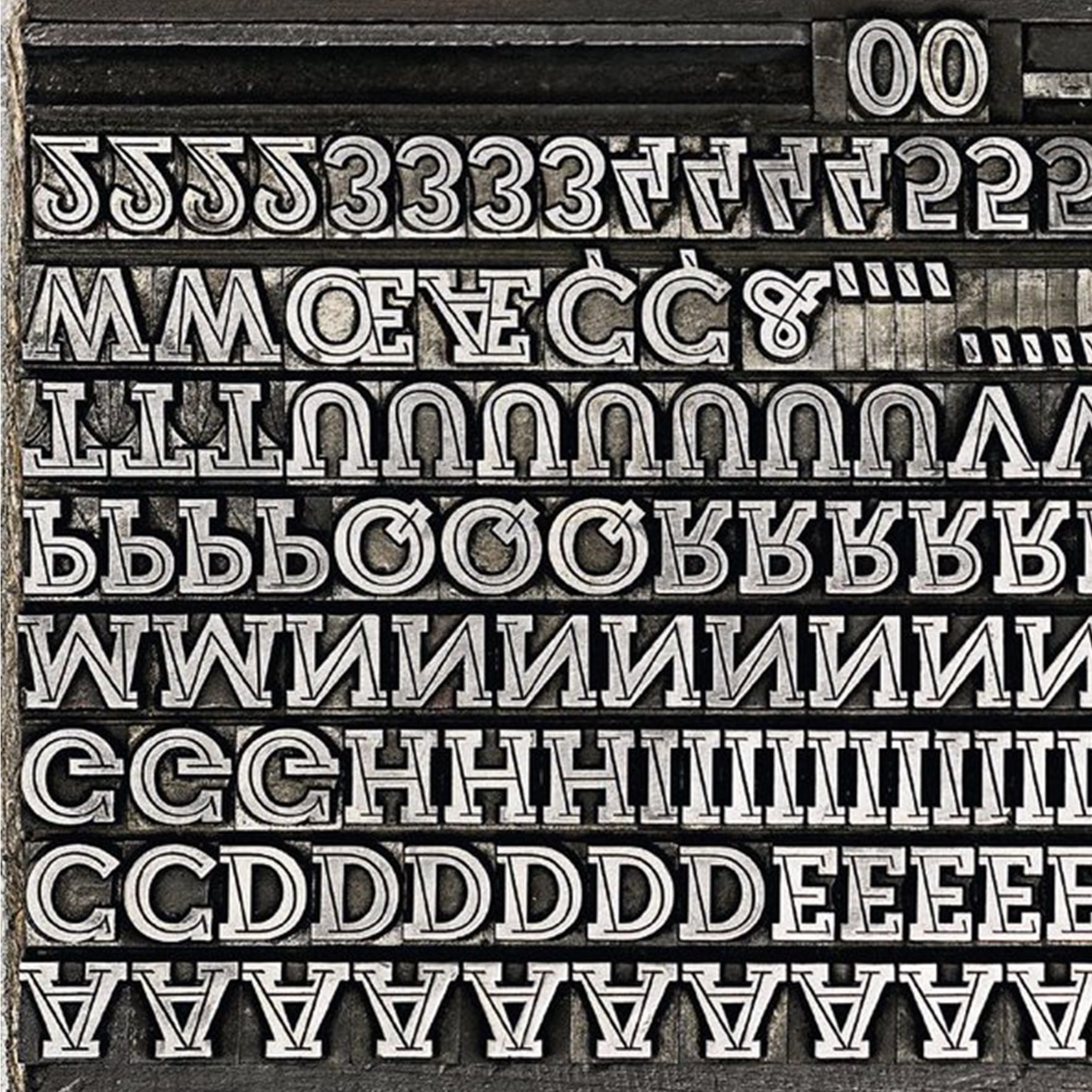
C’è un carattere tipografico che ha accompagnato per decenni le immagini delle cartoline illustrate: il Veltro, disegnato dallo studio artistico Nebiolo nel 1934 e poi prodotto fino al 1961. La storia e le storie di questo carattere, sofisticato nella progettazione ed estremamente popolare nell’utilizzo , sono raccontate nell’ultimo numero della rivista TIPOITALIA edita dalla Fondazione Tipoteca Italiana http://bonvini1909.com/negozio/#prd-2529 in un bell’articolo-ricerca di Riccardo De Franceschi.
Il carattere Veltro è ben presente nei cassetti della nostra Tipografia ed è stato utilizzato in passato nella produzione di cartoline che i Fratelli Bonvini realizzavano con soggetti della vicina Piazza San Luigi, di Corso Lodi e di Milano.
Provate a guardare tra le vostre vecchie cartoline, quante utilizzavano il Veltro per il titolo? Se ce le mandate le pubblichiamo volentieri, se sono tante ne facciamo una bella vetrina.
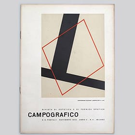
Among the many objects telling the century-old history of Fratelli Bonvini, there is a big and valuable collection of Campo Grafico, which we found at the time of the renovation of our shop. The magazine was founded in 1933 by the versatile Attilio Rossi (1909 – 1994). Campo Grafico was a highly innovative magazine, brave and able to go beyond conventions and the inhibited style of the typographic art of its time. Attilio Rossi created the magazine when he was just 24 years old in an attempt to explore new creative paths of typographic art and to propose the Bauhaus experiences and the new artistic trends that were developing in Europe. Today, Campo Grafico is exhibited in the greatest design museums all over the world. It was originally published in 66 issues, whose mission it was to spread the versatility of typography and the influence of modernity. It also expressed a strong criticism towards the competing magazine, “Risorgimento Grafico”, directed at the time by typographer Raffaello Bertieri, who was considered redundant and conservative. If you are interested, almost the whole collection of Campo Grafico (the last issue was published in 1939) will soon be available for consultation in our shop. Not a single issue of Risorgimento Grafico was found in the shop – this could mean that Fratelli Bonvini preferred and supported less conventional compositions, as the many and eclectic stereotypes in our drawers reveal.
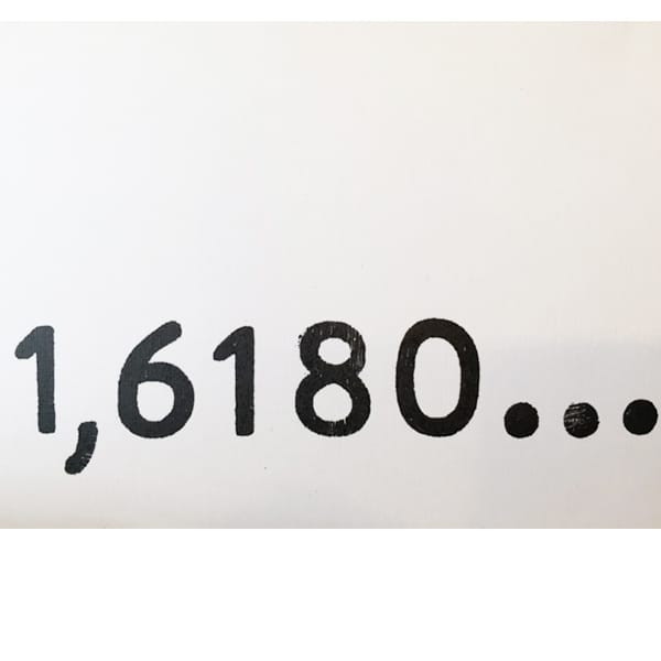
Monday, June 6th, at 18.00 we will inaugurate the exhibition “Monografia”. 12 works by Nazzareno Guglielmi inspired on one single object: the golden ratio.
1.6180: an irrational algebraic number which, due to its mathematical and geometric features, has often represented – in different historical and cultural moments – both an ideal of beauty and a possible connection between macrocosm and microcosm, between universe and nature. Together with distinguished guests (Fibonacci, Magritte, Leonardo, ecc.), Nazzareno Guglielmi develops his own poetic and artistic research on the golden ratio, filling the eye and the mind of the audience with new questions and curiosity. A card/artwork by Nazzareno Guglielmi will be printed during the event and given as a gift to participants. We’ll be expecting you at 18.00 – via Tagliamento 1, Milan
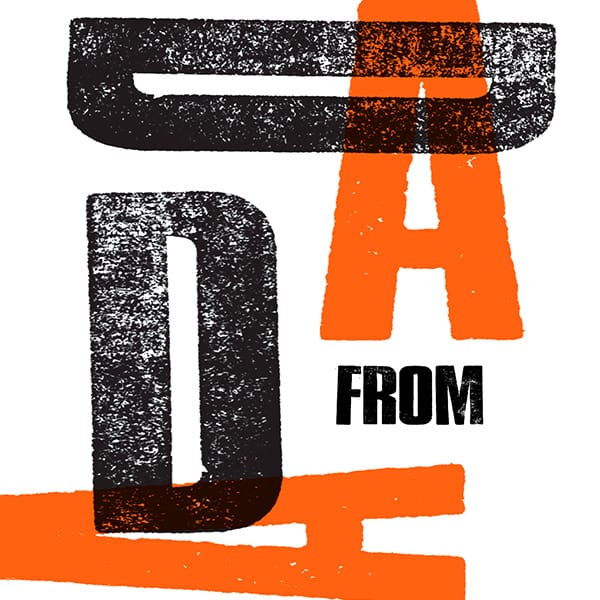
Design and production of a poster inspired on the Dadaist movement with wooden typefaces and print with proof press. Every participant will work on a project to take home. Saturday, May 21st from 10.00 to 17.00 Cost: € 70.00 per participant (max. 6 participants). The cost includes the material.

Three courses to learn how to compose and print using wooden typefaces, together with Laura Dal Maso and Mauro de Toffol, from Cabaret Typographie. Laura and Mauro have worked for years on the languages of typography and art, producing high quality posters and graphics in their studio. For three days, the research and the experience of Cabaret Typographie will move to via Tagliamento 1, at Fratelli Bonvini’s. DADA POSTCARD: a day dedicated to Dadaism, 100 years after the creation of this movement. Production of postcards and small formats using wooden typefaces and print with proof press. Every participant will work on a project to take home. Saturday, May 14th from 10.00 to 17.00 Cost: € 70.00 per participant (max. 6 participants). The cost includes the material. DADA POSTER: Design and production of a poster inspired on the Dadaist movement with wooden typefaces and print with proof press. Every participant will work on a project to take home. Saturday, May 21st from 10.00 to 17.00 – Cost: € 70.00 per participant (max. 6 participants). The cost includes the material. PRINT ON COTTON: SHOPPING BAG: Composition with wooden typefaces and print with proof press. Every participant will produce a bag to take home. Saturday, May 21st from 10.00 to 15.00 – Cost: € 50.00 per participant (max. 6 participants). The cost includes a printed shopping bag. For booking and further information: info@bonvini1909.com
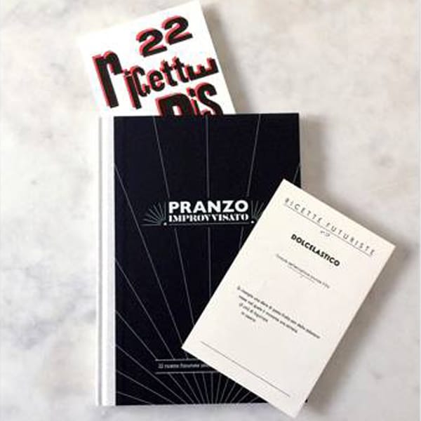
Avete mai assaggiato i Garofani allo Spiedo, il Paradosso Primaverile o il Dolcelastico? Fratelli Bonvini non è un ristorante ma in questa occasione, si trasformerà nel tempio della Cucina Futurista con la presentazione del volume Pranzo Improvvisato. 22 ricette futuriste interpretate da 22 illustratori internazionali; un progetto curato da Cristina Amodeo, Ilaria Faccioli e Gaia Stella. A disposizione del pubblico anche la raccolta di ricette composte in monotype e stampate con caratteri in legno da Fratelli Bonvini.
Fratelli Bonvini Milano
Cartoleria e Tipografia dal 1909
Via Tagliamento, 1 - 20139 MILANO
Tel. +39 025392151
WhatsApp 3403267097

