STATIONERY FEVER

STATIONERY FEVER

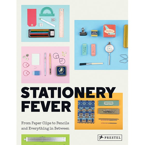
On Friday December 2nd at 18.30, we will present the book Stationery Fever. An itinerary through origins, history and anecdotes about rubbers, pencils and pencil sharpeners, and many other stationery items. A journey through the places where they are produced with the designers who created them. We’ll discuss it at Bonvini with Giulio Iacchetti, Luca Bendandi and Luca Bogoni. We’ll be expecting you.


FUTURA

FUTURA

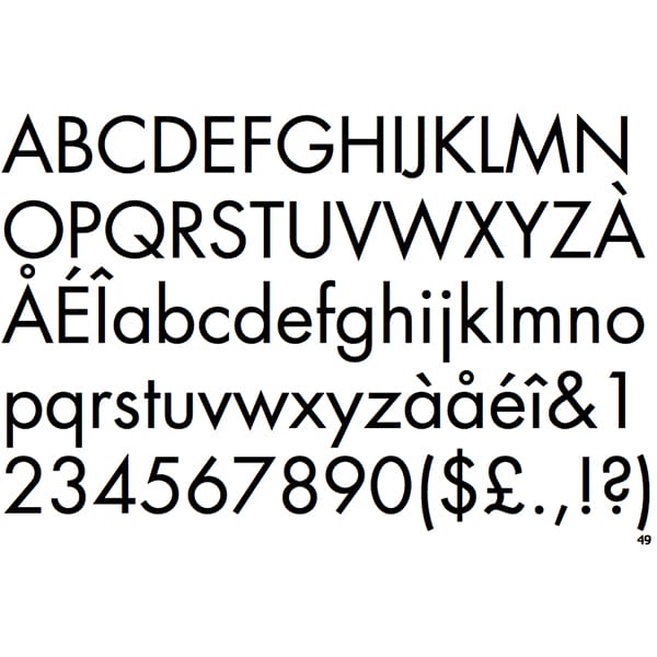
Last news in August: we will dedicate it to the great Paul Renner (Wernigerode, August 9th 1878 – Hödingen, April 25th 1956), a typographer and designer known above all for having designed an extremely successful typeface, which has become a timeless masterpiece: the Futura.
Renner was a graphic and typeface designer of extraordinary importance for graphic designers and typographers of the 20th century. His Futura typeface, which finally saw the light in 1927 after a many difficult re-elaborations, became the typeface that interpreted the cultural and aesthetic turn of the 20th century, radically influencing the discipline of typeface design and later penetrating into typographical workshops worldwide.
On the one hand, the Futura font represented the technical and formal solution to that strive for modernity that had driven European typographic culture since the Bauhaus movement. On the other, it was the perfect answer to the new expressive needs of the printing industry and of communication.
Today Futura is still one of those typefaces with which “you can never go wrong”. Almost 90 years from its creation, it is still the Sans Serif font, which, with its articulated and diverse typographical “strengths”, imprints a modern style on any layout, logo, advertising poster or coordinated visual identity.
Paul Renner was also a professor and an active intellectual who strongly opposed Nazism. In 1933 – the same year in which he was commissioned with the graphic design of the German Pavilion at “Triennale di Milano” and awarded the Triennale prize – he was removed from office because he was classified as a “subversive intellectual” after having published an essay on “Bolshevik culture” in which he explicitly opposed the violent and repressive Nazi culture. He was marginalized, exiled and finally arrested.
A painter, a cultured and untiring reader, and a great scholar of philosophy, he continued to work in the post war period, where he designed typefaces and wrote essays on typographic design leaving a generous and crucial legacy of studies on the modernizazion processes in writing and publishing. In addition to Futura, he also designed the Plak (1928), the Ballade (1937), the Renner Antiqua (1939) and further versions of his unforgettable Futura.
Thank you, Renner: thanks to you, the future of typography has arrived earlier than expected.

HOLIDAY POSTCARDS

HOLIDAY POSTCARDS

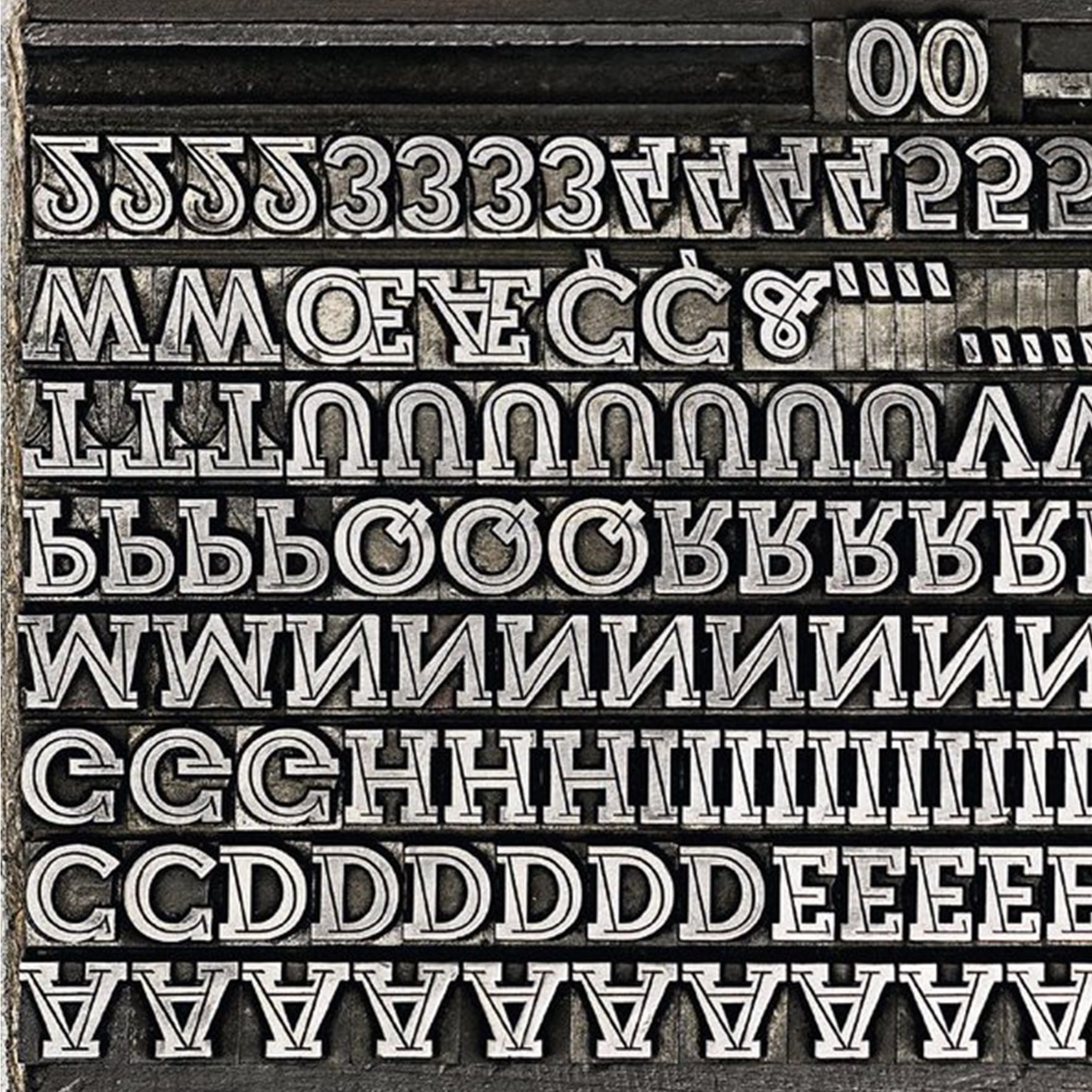
There is one font that for decades has always accompanied illustrated images on postcards: the Veltro, designed by Nebiolo art studio in 1934 and produced until 1961. The history and the stories of this font, characterized by a sophisticated design and a very widespread use, are collected in the last edition of the magazine TIPOITALIA, published by Fondazione Tipoteca Italiana http://bonvini1909.com/negozio/#prd-2529 in a very interesting research article written by Riccardo De Franceschi. Our drawers are plenty of Veltro typefaces and we have used it in the past in our postcard production featuring the nearby Piazza San Luigi, or Corso Lodi, or Milan. Take a look at your old postcards. How many of them used the Veltro font in the title? If you send us your postcards we will be more than happy to publish them. And if you have many, we can dedicate a whole shop window to them.

NOTEBOOKS OF PROSE AND INVENTION

NOTEBOOKS OF PROSE AND INVENTION

“What do lions do when they wait for their tamer? They study the script”. And you? Come and discover “Il Taccuino del marziano” (The Martian’s notebook) by Ennio Flaiano, and other books published by Henry Beyle. Let’s celebrate the first 50 titles of the collection “Quaderni di prosa e di invenzione” (Notebooks of Prose and Invention), on Thursday, June 23rd, at 18.00.

ANELLI E GEMELLI

ANELLI E GEMELLI

Singoli caratteri, numeri, punteggiature, inizi e pause di conversazioni e di lettere, di frasi d’amore.

Nel 1904 l’ingegnere Julius Mohns cominciò a progettare, in Germania, un nuovo modello di macchine da scrivere che, negli anni a venire, avrebbe avuto un grande successo in tutta Europa competendo, per la prima volta, con le macchine da scrivere progettate e costruite in America: il modello Continental.

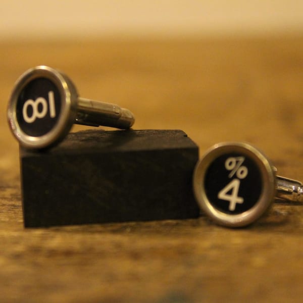
Continental era una robusta macchina da scrivere per ufficio. La produzione, cominciata con 24 esemplari, proseguì fino al 1949, con piccole modifiche sui modelli, fino a realizzarne complessivamente alcuni milioni. Il design deciso e gentile dei tasti di una vecchia Continental sono, oggi, stati recuperati da un giovane designer artigiano, Marco Magliozzi e trasformati in anelli e gemelli realizzati in acciaio rodiato.

In vendita da Bonvini.
SONO ARRIVATI I MAPPAMONDO

SONO ARRIVATI I MAPPAMONDO

“La via più breve per giungere a sé stessi gira intorno al mondo” Hermann Keyserling.

Non occorre essere navigatori o esploratori per godere della bellezza di un mappamondo: un oggetto utile, affascinante, a tratti addirittura ipnotico, che regala mille suggestioni. I libri fanno viaggiare attraverso le loro storie scritte su pagine, i mappamondo, con il loro tracciare il globo, suggeriscono luoghi lontani, popoli eccelsi e paesaggi selvaggi.

Da oggi disponibili da Fratelli Bonvini.